ShopDreamUp AI ArtDreamUp
Deviation Actions


Suggested Deviants


Suggested Collections


You Might Like…


Featured in Groups


Description
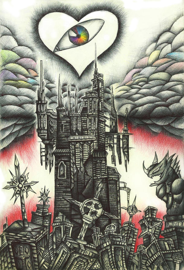
I would like to hear an interpretation of you about the drawing!  Is not necesary but i would really apreciatte what you understand about it! ^__^
Anyways, when i am at university i draw stuff. This was made using Ballpoint Pens and some colours. Just that. My first work with ballpoints! :3 Done on my free time, you know... while i am waiting at the university i can't work on my colored works... so i have to draw with the most simple weapon: Ballpoint Pen. Thisis the work i feel most sentimental of. Because i worked on in almost everywhere.
I worked on it for about... 12 days. But i am VERY happy with the final results, i think it worthed! Well, let's see wich what i can come next! Thank you to all the people who  it and MORE THANKS to all the people who comment, i apreciatte interpretations about the drawing too.
 What about my inspiration? I got it from The World that Never Was from Kingdom Hearts, i love places and inspiration, and i hope people gets inspired as well. (: There is nothing wrong in getting inspired.
 "I really liked the piece you shared, that is power. Power and storytelling are major pluses! That piece is spot for getting people to think."
- Jerry Frech
Anyways, when i am at university i draw stuff. This was made using Ballpoint Pens and some colours. Just that. My first work with ballpoints! :3 Done on my free time, you know... while i am waiting at the university i can't work on my colored works... so i have to draw with the most simple weapon: Ballpoint Pen. Thisis the work i feel most sentimental of. Because i worked on in almost everywhere.
I worked on it for about... 12 days. But i am VERY happy with the final results, i think it worthed!
- Jerry Frech
Image size
1585x2319px 3.97 MB
Make
HP
Model
HP Scanjet dj_d02a
© 2011 - 2024 Paulcellx
Comments442
Join the community to add your comment. Already a deviant? Log In
Bueno aqui va mi primera critica a ti <img src="e.deviantart.net/emoticons/b/b…" width="15" height="15" alt="
Empezemos con los dibujos; los edificios estan muy bien hechos y muy detallados el problema que veo es que este estilo gotico ya esta muy repetido entre muchos artistas. Si ya se que esta basado en el the world that never was pero me encantaria ver un toque mas personal tuyo. En otras palabras quiero decirte que tus dibujos tengan ese algo que identifique que es tu estilo.
La tecnica esta muy bien empleada, no se notan espacios en blanco y si se ven son muy pequeños. Muy buen uso de la sombra (algo que yo no puedo hacer) y los detalles como dije antes estan sensacionales.
Los colores es algo que te identifica mucho, aplicas colores muy oscuros combinandolos con un poco de colores brillantes y esa combinacion es excelente. Quisiera que experimentaras un poco con tus colores y uses colores mas brillantes como el crystal castle y abandona por un rato los colores oscuros, te caera muy bien eso.
Visualmente el paisaje impresiona mucho y atrae a muchos deviants lo cual es muy bueno y te ganas mucha popularidad.
En conclusion el dibujo y la tecnica empleada son excelentes, lo unico que debes hacer es usar tus marcas personales. Es cierto que muchos artistas se inspiran de algo para crear pero cuando lo hacen le ponen su toque, su firma, su marca personal algo que tu debes de definir.
Impresionante trabajo.